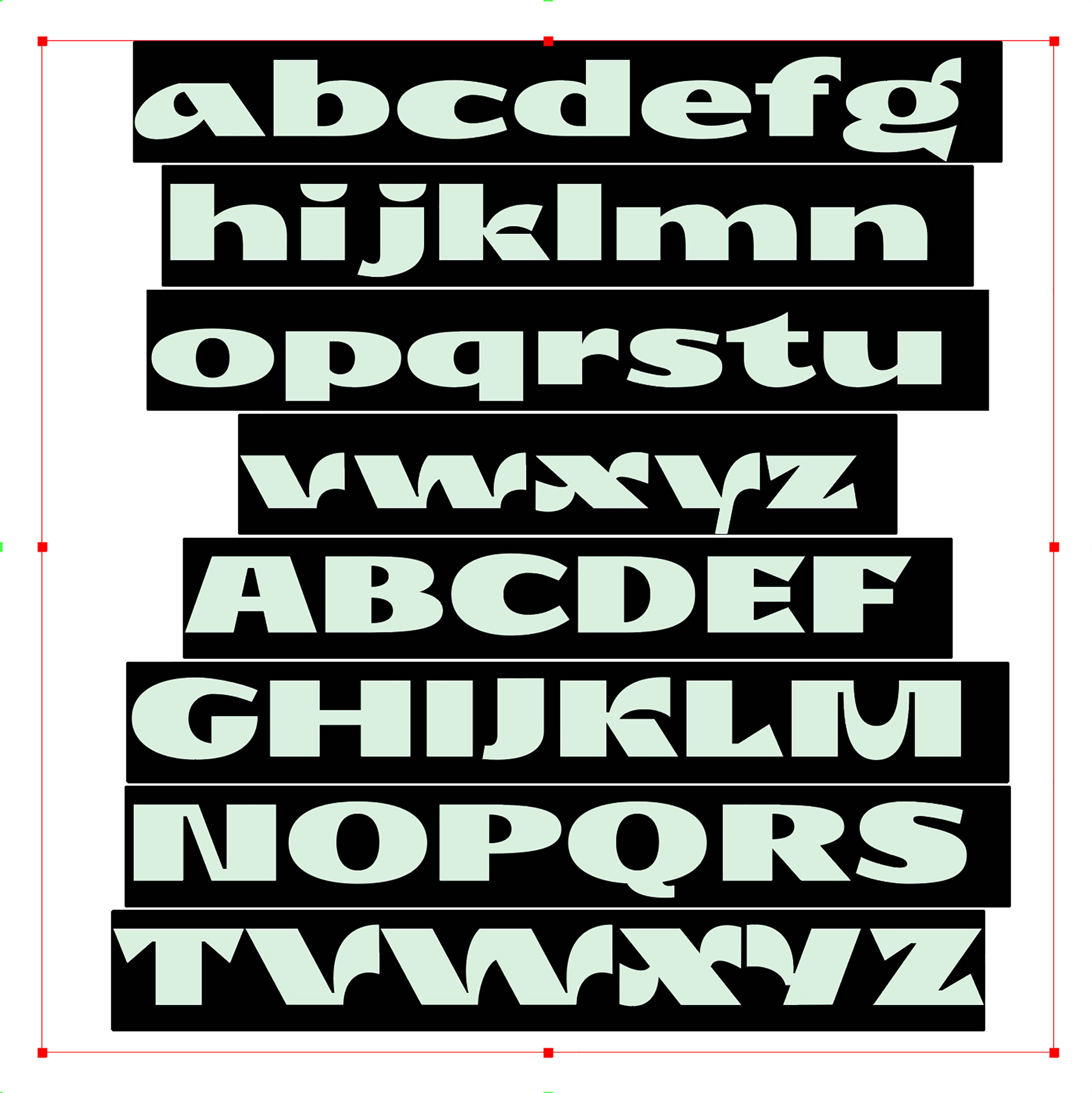
Solod
Typeface design
Typographical merge of traditional Cyrillic and
Humanist Grotesk constructions.
Solod was developed during Typedesign Workshop.
Work in progress.
Request Typeface Trial⟶
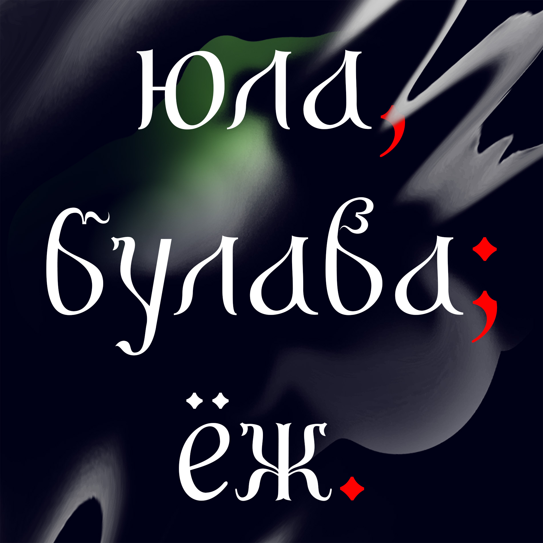
Bilibin
Typographic monument, research
Bilibin is an art memorial and a portrait of stylistic elements of Old Cyrillic Cursive, Vyaz, Poluustav, and elements of Grazhdanskii Schrift. This font is part of my observation of warped shapes of the Cyrillic script, namely, its reform, committed by Peter the Great in the 17th century. This changed the function of the traditional Cyrillic font, reforming the old font into an exclusively political, religious, or plainly decorative.
If you would like to learn more about the research please go to It Is Nice That
Test type ⟶
Type Specimen ⟶
Request Typeface ⟶
Grapho
Typeface design
Grapho is a series of works ranges from ink prints, digital type and installation. The monoline typeface mimicking the concept of action writing. The starting point for Grapho typeface was based on the studies of action writing when writing incorporates the movement of the whole body.
Request Typeface Trial⟶
Clean CRY
Campaign art-direction
I was commissioned to create a digital campaign and to develop a typographical interpretation of the wordplay used as a current brand logo for Clean CRY - experimental clothing line focused on realness, honesty, and pure feelings. Art direction In collaboration with Bernadeta Rimutyte. 3D visuals by Tobias Groot.
The campaign was part of the GRAARE AR exhibition in Museumkwartier, Amsterdam.
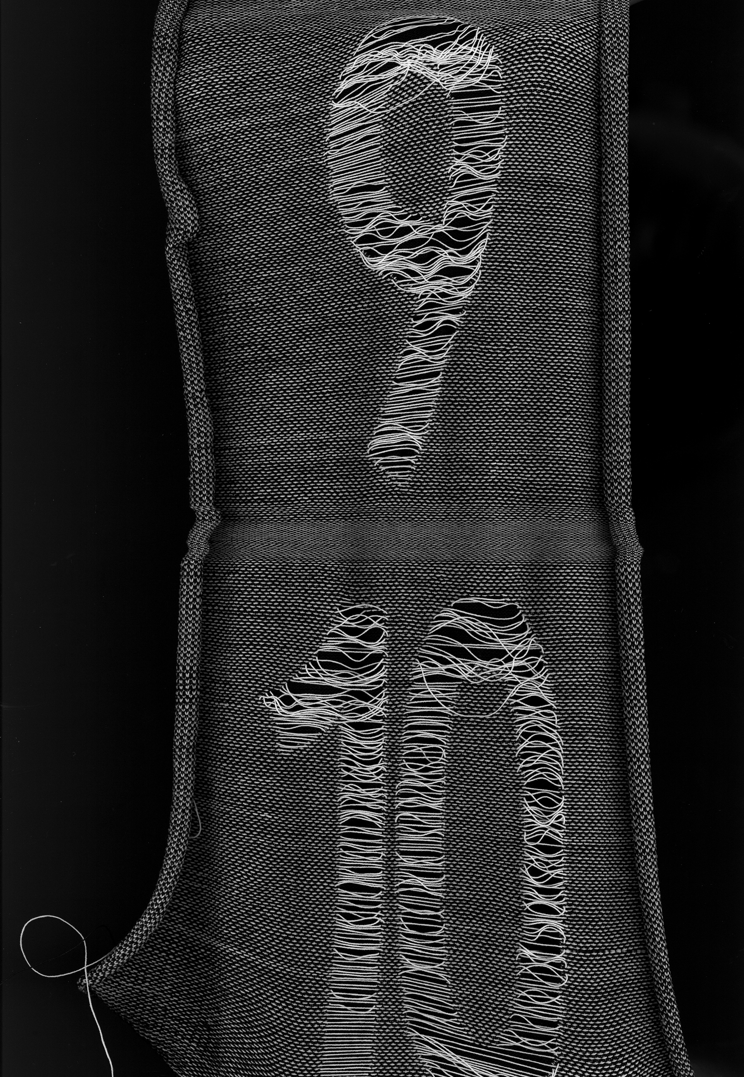
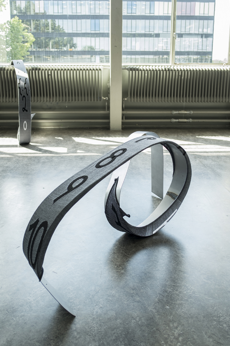
Grapho
Installation: Stainless steel, knits, MDF, Inking roll, oil ink
Installation at the GRA Graduation Show July 2017. Featuring Grapho prints and knitted Grapho typeface and installed on metal monoline constructions.
Installation: Stainless steel, knits, MDF, Inking roll, oil ink
Installation at the GRA Graduation Show July 2017. Featuring Grapho prints and knitted Grapho typeface and installed on metal monoline constructions.
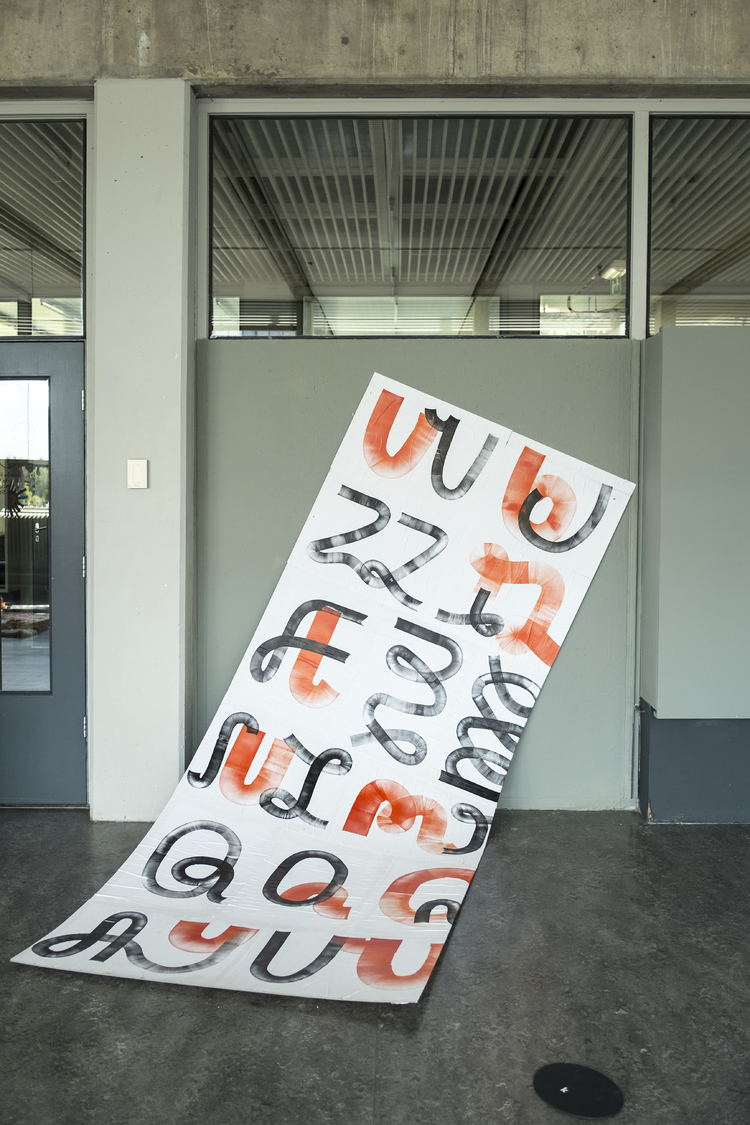
Grapho
One copy book: Inking roll, oil ink
Series of prints which led into the development of the Grapho Typeface.
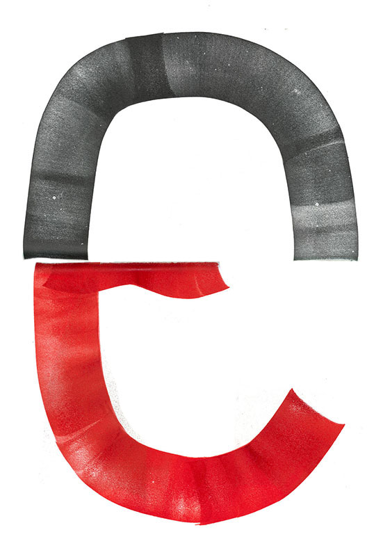
The term ‘Grapho’ means to write, with reference to the form of the letters; to delineate (or form) letters on a tablet, parchment, paper, or other material; I challenged my handwriting by making letters with an inking roll. The process developed into the questioning of possible and preferred movements of my hand. The connection of the strokes on a surface, and how to connect strokes with one another, was main focus of my investigation – the curves in the letters are the result of a continuous movement.
When it came to the digitisation of the letters, to make a font, the possibilities of translating them from one media to another came to the forefront. The original ‘inking roll’ version of the typeface only consisted of capital letters, and through the digitisation process I decided to work with the same thickness of stroke vertically and horizontally. This turned the typeface into a monoline, which also helped me to come up with the shape of the lower case letters. Lending itself to the name Grapho.
In order to apply the digitised font practically on a fabric material a knitting technique was chosen where the font becomes ‘one’ with the material – and the material influences the shape and modifies the font again. This process grows into a constant generating cycle, which leads from one ‘font’ to another, through its translation into different media.
See more ⟶
One copy book: Inking roll, oil ink
Series of prints which led into the development of the Grapho Typeface.
The term ‘Grapho’ means to write, with reference to the form of the letters; to delineate (or form) letters on a tablet, parchment, paper, or other material; I challenged my handwriting by making letters with an inking roll. The process developed into the questioning of possible and preferred movements of my hand. The connection of the strokes on a surface, and how to connect strokes with one another, was main focus of my investigation – the curves in the letters are the result of a continuous movement.
When it came to the digitisation of the letters, to make a font, the possibilities of translating them from one media to another came to the forefront. The original ‘inking roll’ version of the typeface only consisted of capital letters, and through the digitisation process I decided to work with the same thickness of stroke vertically and horizontally. This turned the typeface into a monoline, which also helped me to come up with the shape of the lower case letters. Lending itself to the name Grapho.
In order to apply the digitised font practically on a fabric material a knitting technique was chosen where the font becomes ‘one’ with the material – and the material influences the shape and modifies the font again. This process grows into a constant generating cycle, which leads from one ‘font’ to another, through its translation into different media.
See more ⟶
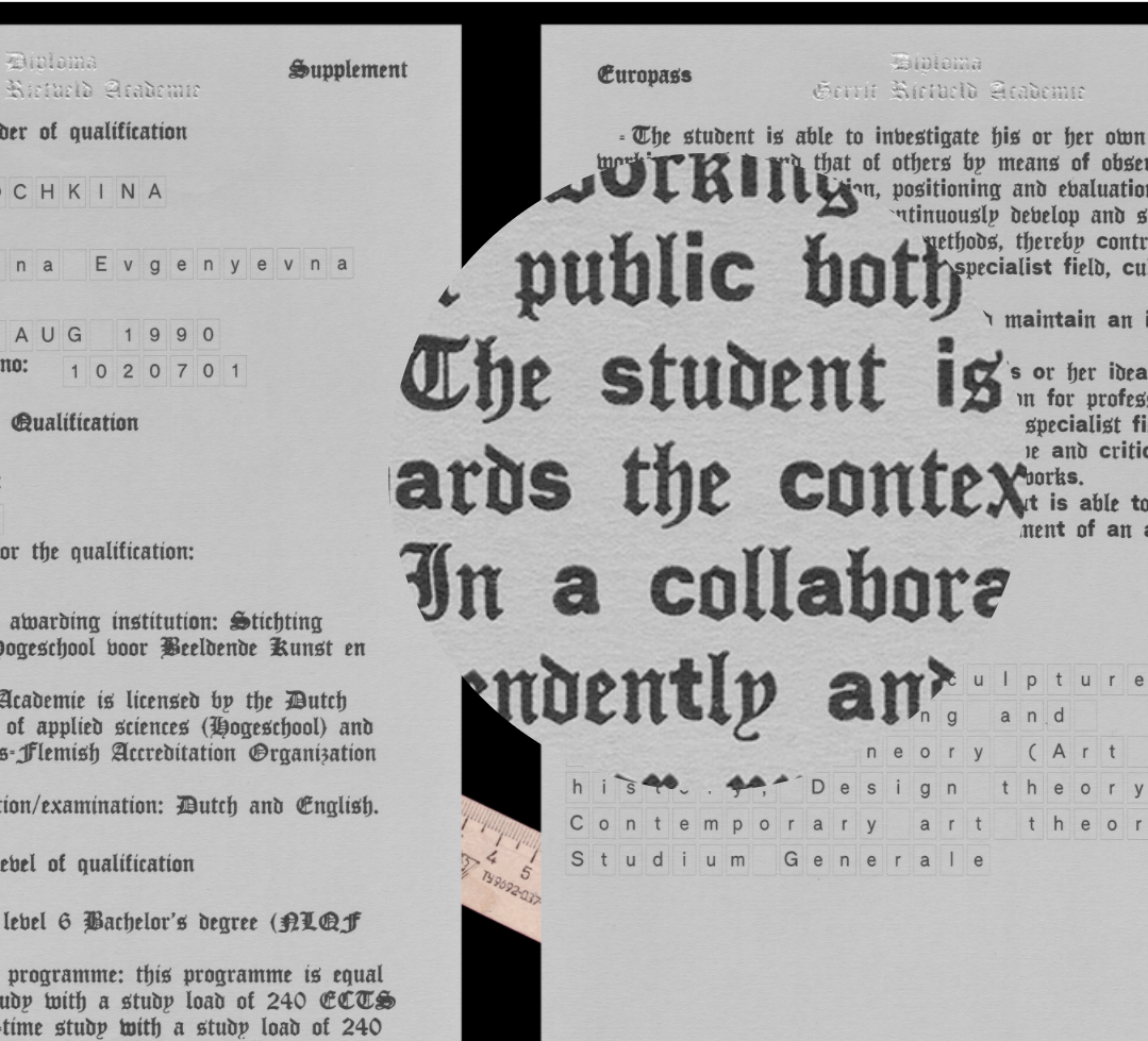
DIPLOMA
Letterpress, indigo print, offset print, foiling, embossing
In colaboration with Cyril Pitet we designed diploma of 2017 for the Gerrit Rietveld Academie. Our focus was based on simplicity and restrictions of legal document form where we tried to combine two temporal aspects (past and present) of an administrative paper. First by typographical choices (blackletter and sans serif), and second by printing techniques where we had a chance to juxtapose an old-timey letterpress vs nowadays digital printing.
I can not conceal the fact that in this project we experienced the clash of our design idea not only conceptually but also physically, through hard labor of making a layout of every single page, then printing 200 copies by hand is absolutelly contrasting digital printing with it's various choice, swiftness and simplicity. The diploma is composed of one main diploma page, five supplement pages, and one poster containing an overview of the National Dutch educational system packaged in office supply thick transparent folder. This diploma has been mentored and produced in collaboration with Lotte Schroder, Joos Wiersinga, Public Rietveld, Bieneke Bennekers and Tim Bijer. Special thanks to Laurenz Brunner for a digital version of the Dick Dooijes typeface ‘Mercator’ and De Monsterkamer for paper advice.
Have a close look at the details ⟶
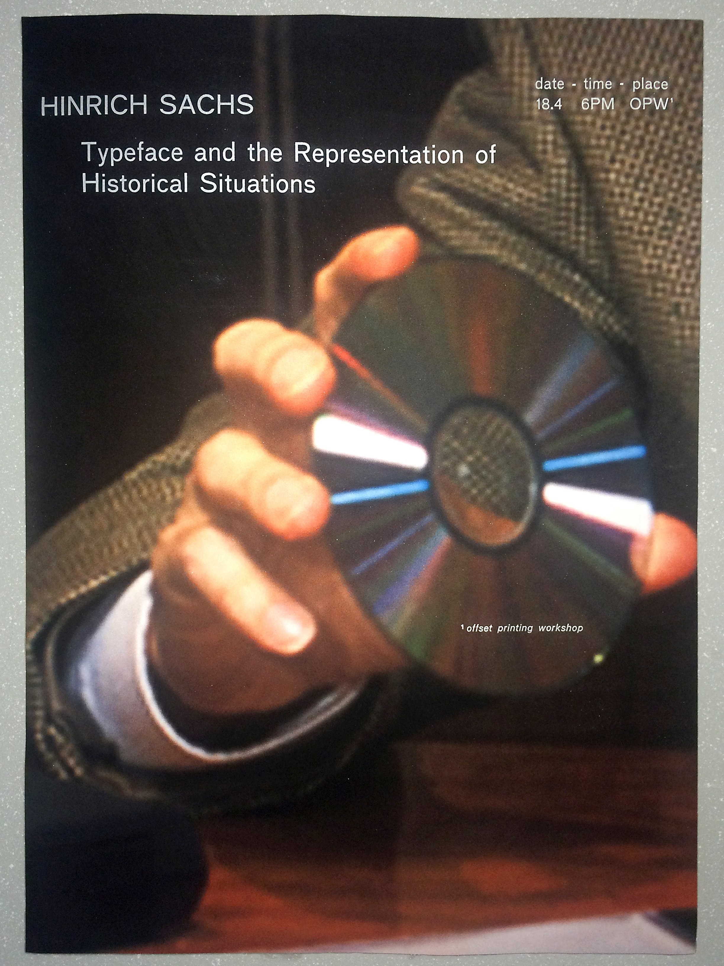
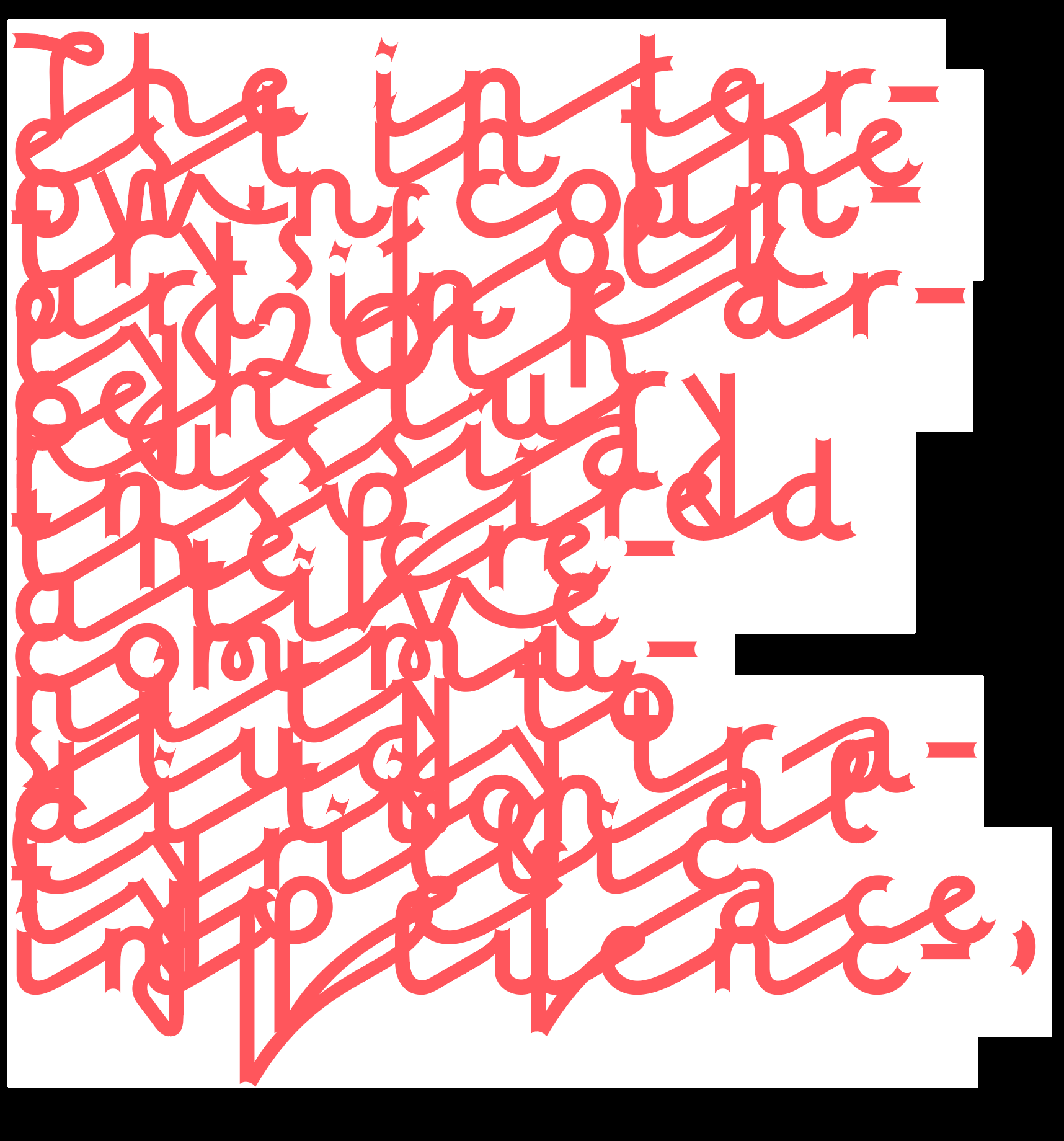
Typeface and the Representation of Historical Situations
Digital print on 70g paper, letterpress with pearl powder
Poster for the lecture of Hinrich Sachs about socio-cultural meaning of typefaces.
Digital print on 70g paper, letterpress with pearl powder
Poster for the lecture of Hinrich Sachs about socio-cultural meaning of typefaces.
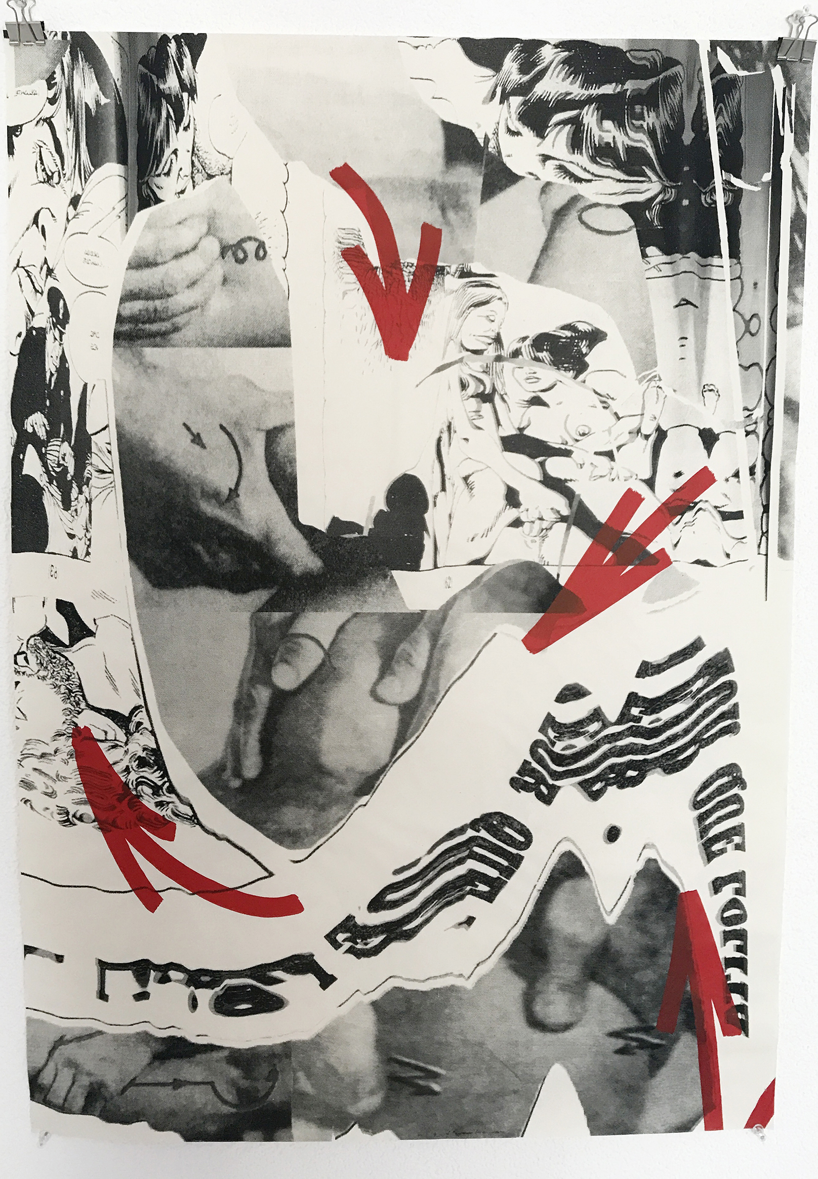
Self Healing
Silkscreen on 70g paper
Silkscreen on 70g paper